DART Magazine
Branding Design. 2023-2024.
DART Magazine is an independent art & design magazine, dedicated to collecting and showcasing the art and designs that can tell good stories, from creators all around the world since 2023. DART Magazine is located in and originated from Davis, California.
For me, DART Magazine is a project that has kept pushing my boundaries in design and communication.
The idea started in 2023, during my years-long journey as a self-taught magazine manager, designer, accountant, and leader for DART, my vision of design has transformed dramatically as DART grows. For a great amount of time, this project has been a one-man job; while inputting a large amount of time, I was able to design across different media, understanding how design can communicate through different dimensions and interactions with the readers, and maintaining a constancy. For years I thought design was making something look nice, but DART taught me design is building a system out of chaos.
There are 3 key designs I want to show in this portfolio, they all represent a phase in building the branding for DART. They are: DART Font 2023, HW DART, and Branding of DART. The branding part will only be briefly shown in the portfolio.
Starting with DART Font 2023, the very first project of the magazine, because who would submit their work to a magazine that has no works, right? So I made one myself.
DART Font 2023
Typeface Design, 2023.
DART Font. Typeface design.
The DART Font is a minimal typeface seeking a visual balance between curves and angles. Also my first personal typeface design project, now used for DART’s offcial logo and branding purposes.

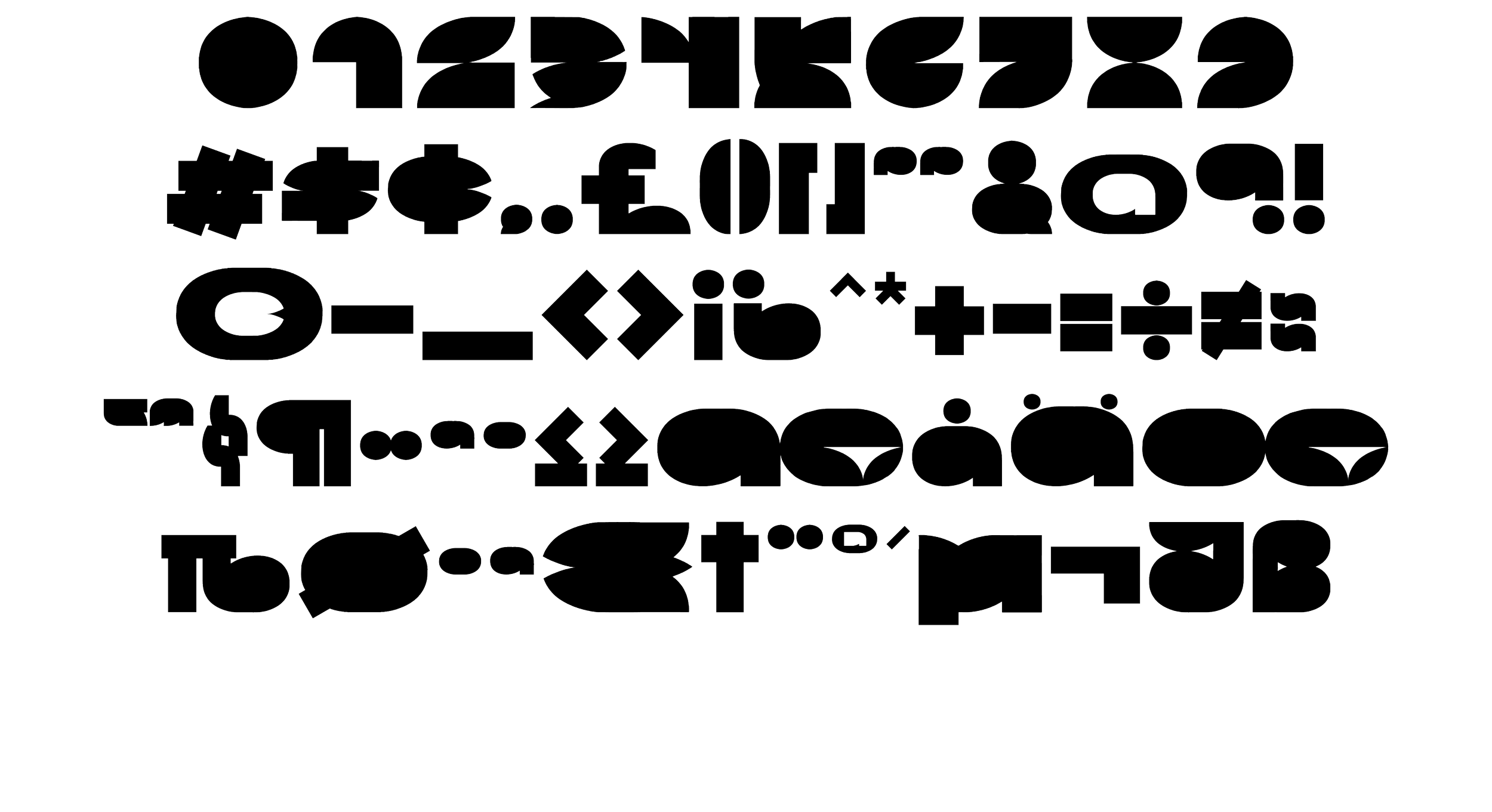

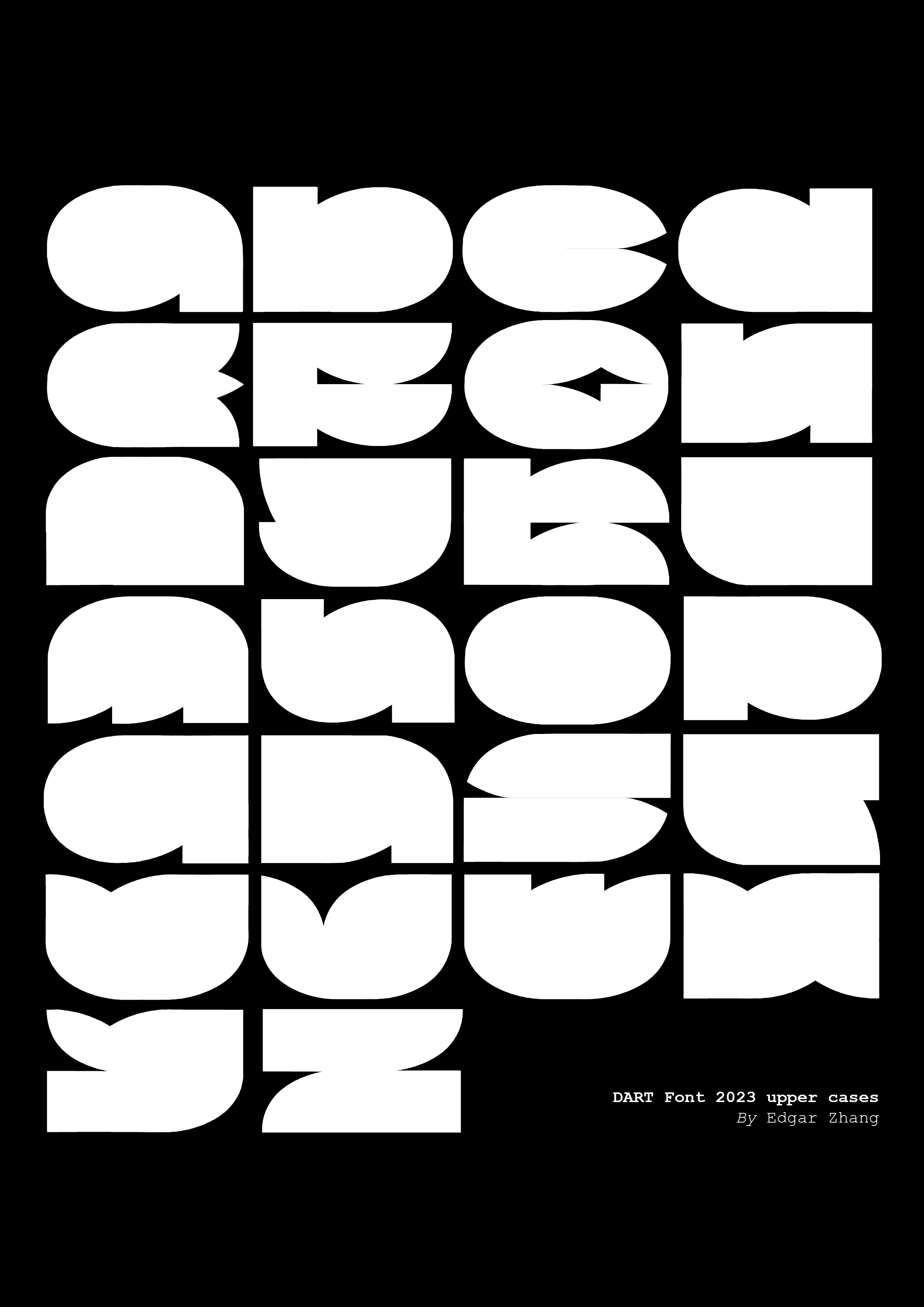
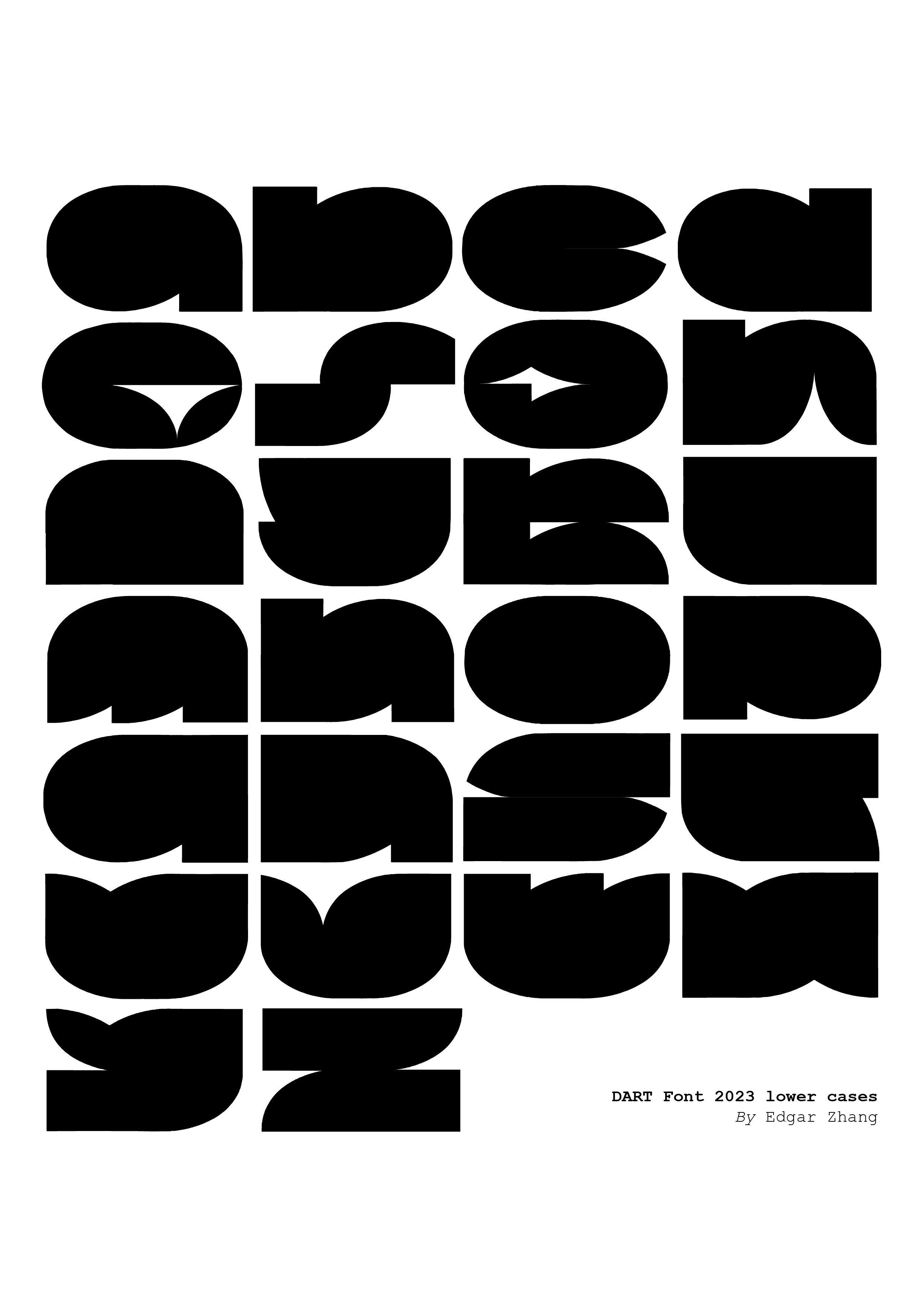
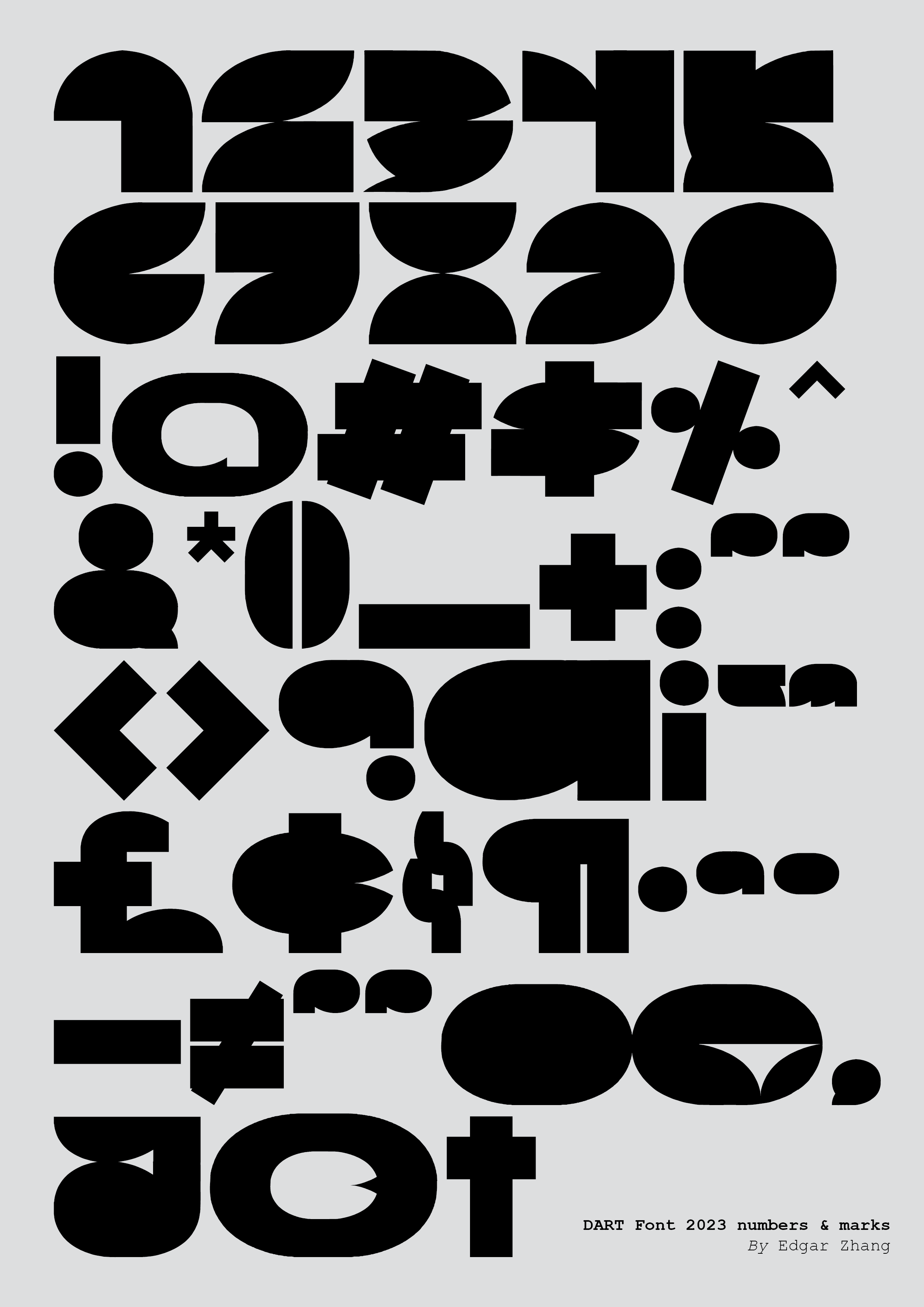
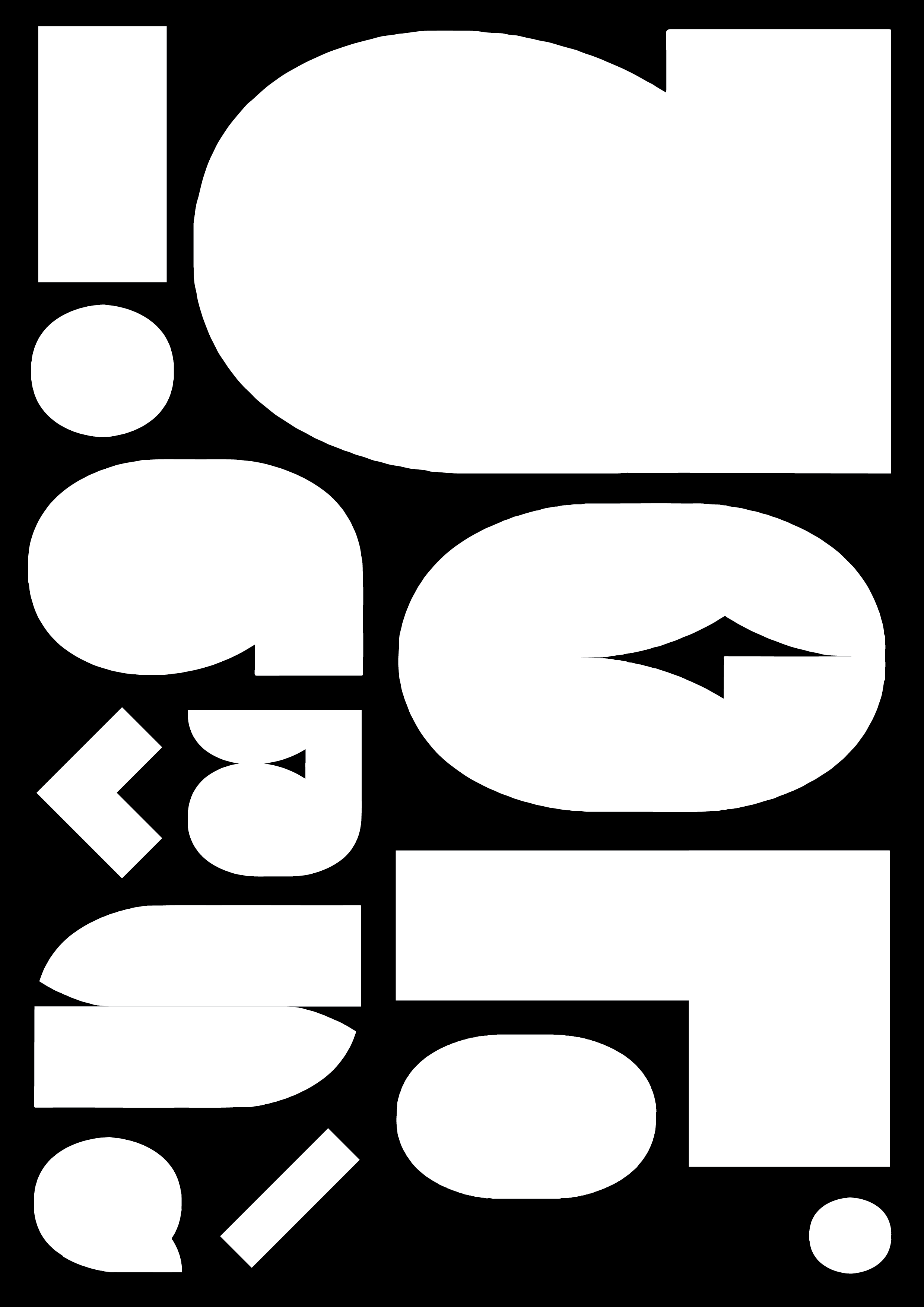
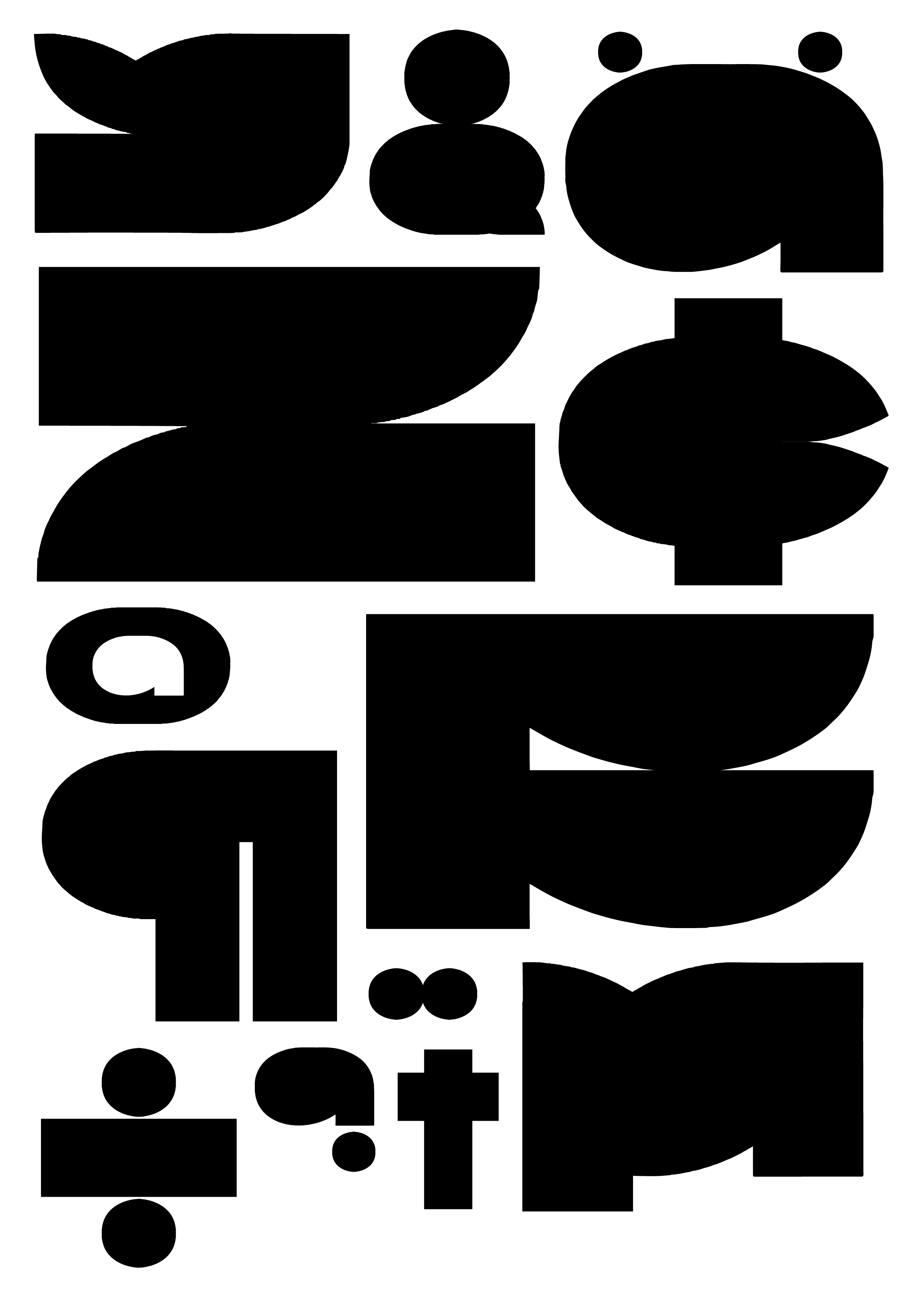
See this work on DART Magazine here.
Next project: HW DART 2024
HW DART 2024
Typeface Design, 2024.
HW DART Bold and Regular are an extension of DART Font. They shared the same direction of design, and their ratio was the same, in other words, they are from the same font family.
However, HW DART is way more readable than DART Font, it is used to inform, while DART Font is used for aesthetic and branding purposes. Compared to DART Font, HW DART had made compromises. They are also created in different ways: HW DART is started with vector mathematical formulas, while DART Font is designed with rasterized lines, then later on transferred into vector.
HW DART demonstrated how lines can be so beautifully curved, and cross each other to create this “imperfect“ handwriting style, that’s what HW stands for. “sketchiness“ and “minimalism“, all in one font.
You can check the full HW DART font below, and it’s free to use, please contact us to get the font file.


HW DART is designed for a diverse user experience. Adjust letter spacing to automatically create continuous writing, just like handwriting. That’s what HW stands for.
HW DART Regular and Bold have minor differences on some letters, this allows it to keep the feature while maintaining consistency in their own style.

As presented in the first line, most of the letters in Bold and Regular are designed using 2 vector curves, just like what we did to DART Font. As a matter of fact, these 2 curves are all orginally from DART Font, all abstracted from the letter “a“.
We also updated something new which is a new curve we presented in line 2, this also allows us to make this font “funnier“, it gives more life to this font.
Official reports here.
Branding of DART
Branding + Website Design, 2024-2025.
Branding of DART mainly included the website design of DART. And some other visuals I designed for DART, can be found in the White Board, where I pin up some graphics during work.
Starting with the website design. When the 4th work was published in the magazine, I realized it was not possible to customize every featured work on the website, that would not be a sustainable way to run the magazine. Therefore, I developed a system for layout.
First, it’s the cover page. usually, it will consist of a wide image and a title, with its genre and release date, but for works that are more mature and of higher quality in production, we used the whole background as its cover. In this way, we subtly delivered a signal to the readers to manage their expectations before scrolling down. If you see the cover being framed, then you should lower your expectations.
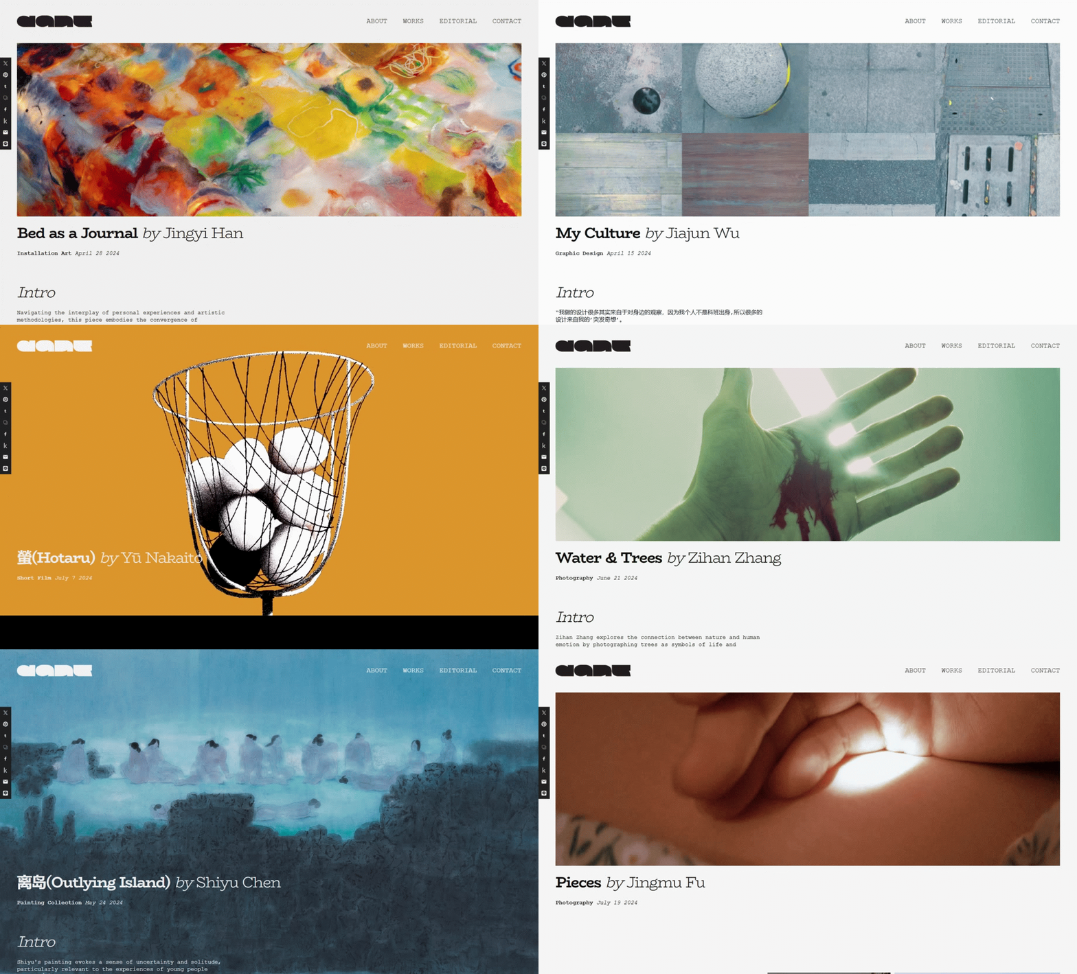
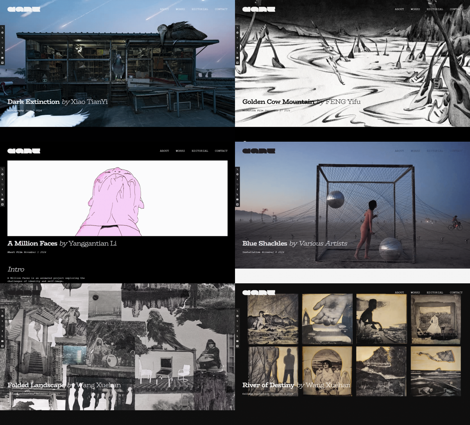
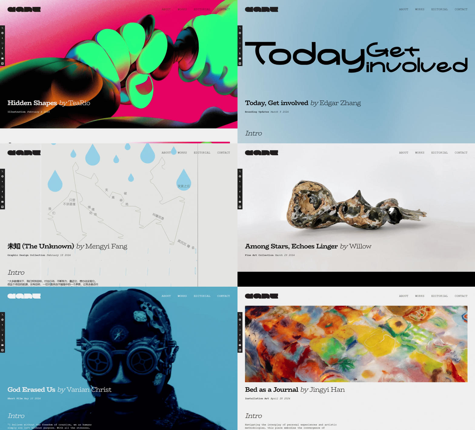
Second, the layout for the body; text on the left with images on the right. Although it will sacrifice some space for displaying images, sometimes it allows you to see the whole image without scrolling.


The tricky part is how to show works differently while following this rule: I used a full background but edited the picture to have something on the right, where the images are supposed to be, so it shows a contrast but still lies in the layout system.


Third, some general pages. This is the very little space where we can directly show our branding, the ABOUT, CONTACT, and EDITORIAL.
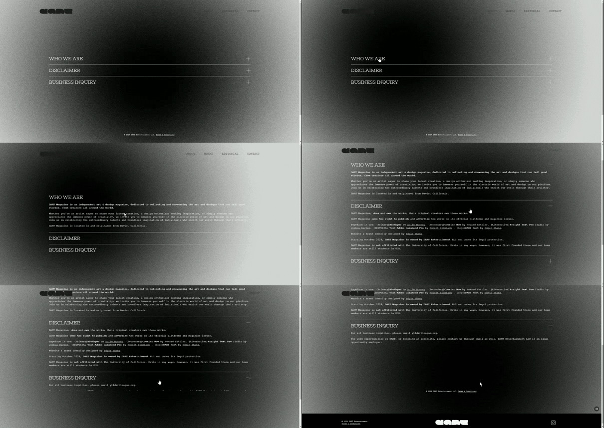

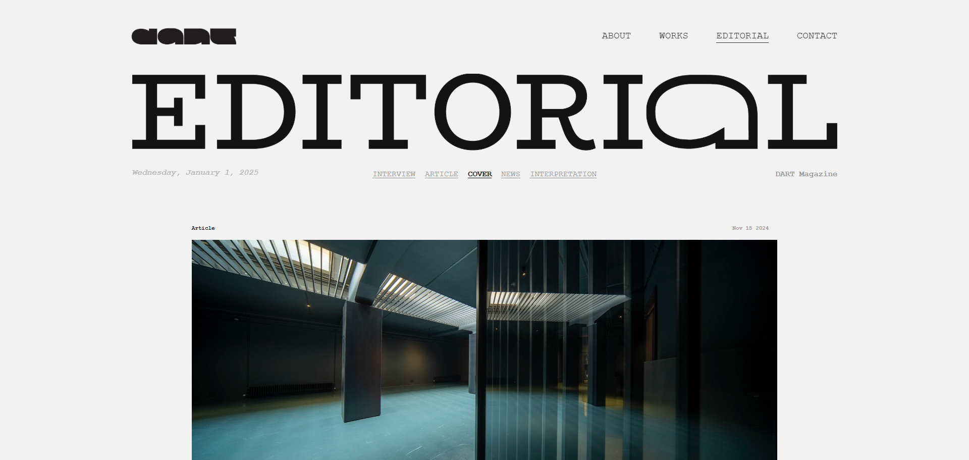
Font selected: (Primary)BioRhyme by Aoife Mooney. (Secondary)Courier New by Howard Kettler. (Alternative)Freight text Pro Italic by Joshua Darden. (EDITORIAL Text)Adobe Garamond Pro by Robert Slimbach . (Logo)DART Font by Edgar Zhang.
